
Bootstrap Toggle clone with Tailwind CSS and Alpine

Interested in learning more about Thymeleaf? Check out my book
Taming Thymeleaf.
The book combines all of my Thymeleaf knowledge into an easy to follow step-by-step guide.
I migrated a project from Bootstrap 4 with the Sleek dashboard template to Tailwind CSS as Bootstrap 4 stopped having bugfixes on 2021-07-01, and there is no version for Bootstrap 5. Anyways, I like Tailwind CSS a lot more to work with :)
One of the components that the project used is Bootstrap Toggle, which makes a simple checkbox look a lot better. As the project kicked out Bootstrap, I needed to build a replacement for it. This blog entry will explain how I did so step-by-step using Tailwind CSS and Alpine.js.
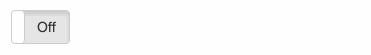
This is how the original Bootstrap Toggle looks:
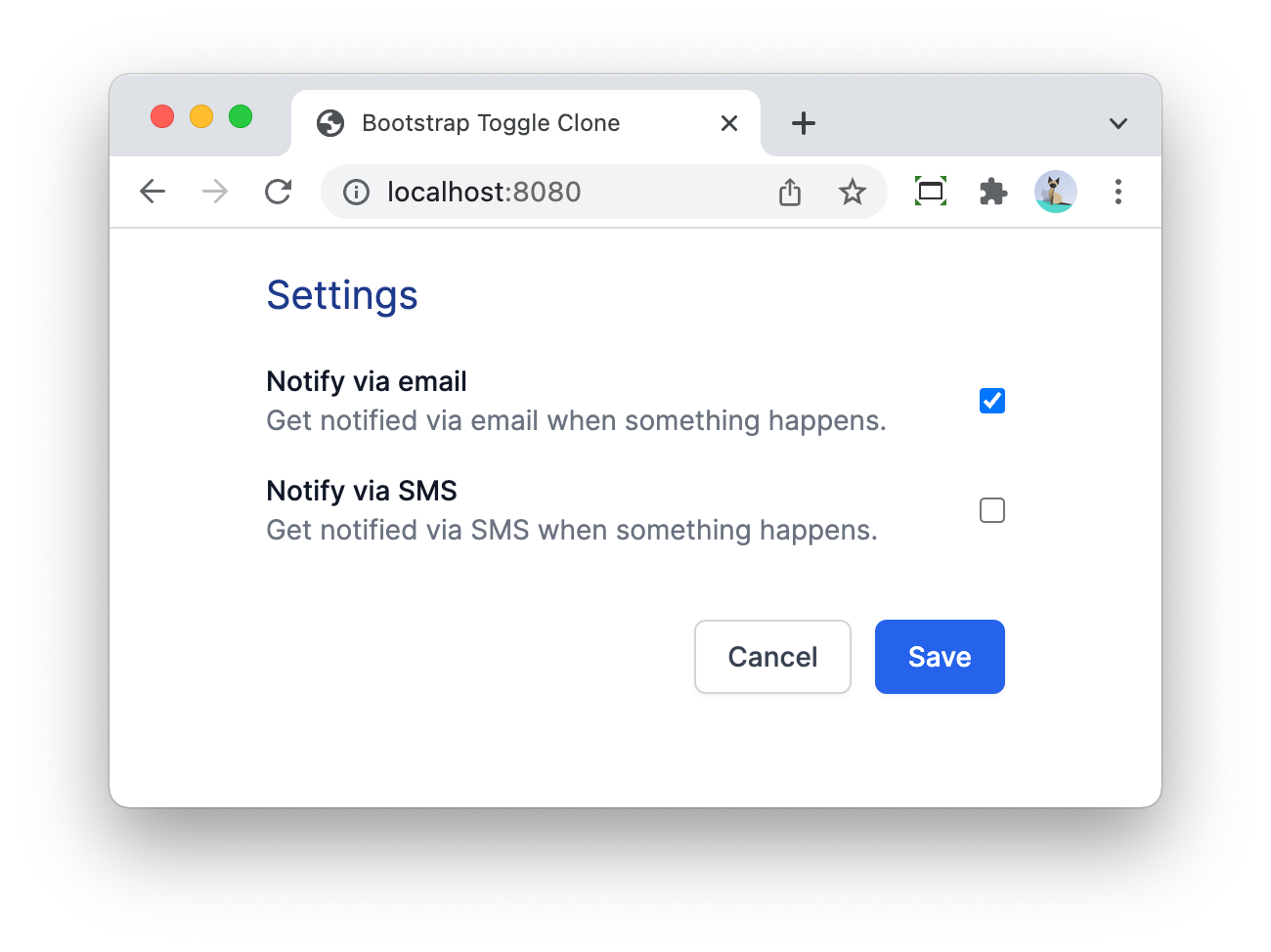
To show the example in the context of an application, let’s build a simple Spring Boot/Thymeleaf application that has a settings page.
Project setup
By default, it looks like this if we use the browser-native checkboxes:
On the Java side, we use a Java record for the settings itself:
public record Settings(boolean notifyViaEmail,
                       boolean notifyViaSms) {
}
The service to keep track of the current settings:
import org.springframework.stereotype.Service;

@Service
public class SettingsService {
    private Settings settings = new Settings(false, false);

    public Settings getSettings() {
        return settings;
    }

    public void setSettings(Settings settings) {
        this.settings = settings;
    }
}
The controller:
import org.springframework.stereotype.Controller;
import org.springframework.ui.Model;
import org.springframework.web.bind.annotation.GetMapping;
import org.springframework.web.bind.annotation.ModelAttribute;
import org.springframework.web.bind.annotation.PostMapping;

@Controller
public class SettingsController {
    private final SettingsService service;

    public SettingsController(SettingsService service) { (1)
        this.service = service;
    }

    @GetMapping (2)
    public String settingsPage(Model model) {
        Settings settings = service.getSettings();
        SettingsFormData formData = new SettingsFormData();
        formData.setNotifyViaEmail(settings.notifyViaEmail());
        formData.setNotifyViaSms(settings.notifyViaSms());
        model.addAttribute("settings", formData);

        return "settings";
    }

    @PostMapping (3)
    public String updateSettings(@ModelAttribute("settings") SettingsFormData formData) {
        System.out.println("Got formdata: " + formData);
        service.setSettings(new Settings(formData.isNotifyViaEmail(), formData.isNotifyViaSms()));
        return "redirect:/"; (4)
    }
}| 1 | Inject the SettingsService. |
| 2 | GetMapping is used for the initial render of the page. |
| 3 | PostMapping is to handle the submission of the form. |
| 4 | Redirect back to the home page after posting the form. |
The controller uses a dedicated form data object:
import java.util.StringJoiner;

public class SettingsFormData {
    private boolean notifyViaEmail;
    private boolean notifyViaSms;

    public boolean isNotifyViaEmail() {
        return notifyViaEmail;
    }

    public void setNotifyViaEmail(boolean notifyViaEmail) {
        this.notifyViaEmail = notifyViaEmail;
    }

    public boolean isNotifyViaSms() {
        return notifyViaSms;
    }

    public void setNotifyViaSms(boolean notifyViaSms) {
        this.notifyViaSms = notifyViaSms;
    }

    @Override
    public String toString() {
        return new StringJoiner(", ", SettingsFormData.class.getSimpleName() + "[", "]")
                .add("notifyViaEmail=" + notifyViaEmail)
                .add("notifyViaSms=" + notifyViaSms)
                .toString();
    }
}
See Form handling with Thymeleaf for more information about using forms and form data objects.
Finally, this is the HTML Thymeleaf template:
<!DOCTYPE html>
<html lang="en"
      xmlns:th="http://www.thymeleaf.org">
<head>
    <meta charset="UTF-8">
    <meta name="viewport" content="width=device-width, initial-scale=1"/>

    <title>Bootstrap Toggle Clone</title>
    <link rel="stylesheet" href="https://rsms.me/inter/inter.css">
    <link rel="stylesheet" href="/css/application.css"/>
</head>
<body>
<h1 class="mx-20 mt-5 text-xl text-blue-900">Settings</h1>
<div class="mx-20 mt-5">
    <form th:object="${settings}"
          th:method="post"
          th:action="@{/}"
          class="space-y-4"
    > (1)
        <div class="flex items-center justify-between">
            <span class="flex-grow flex flex-col">
                <span class="text-sm font-medium text-gray-900" id="notifyViaEmail-label">Notify via email</span>
                <span class="text-sm text-gray-500"
                      id="notifyViaEmail-description">Get notified via email when something happens.</span>
            </span>
            <input type="checkbox" th:field="*{notifyViaEmail}">(2)
        </div>
        <div class="flex items-center justify-between">
            <span class="flex-grow flex flex-col">
                <span class="text-sm font-medium text-gray-900" id="notifyViaSms-label">Notify via SMS</span>
                <span class="text-sm text-gray-500"
                      id="notifyViaSms-description">Get notified via SMS when something happens.</span>
            </span>
            <input type="checkbox" th:field="*{notifyViaSms}">(3)
        </div>
        <div class="pt-5">
            <div class="flex justify-end">
                <button type="button" class="bg-white py-2 px-4 border border-gray-300 rounded-md shadow-sm text-sm font-medium text-gray-700 hover:bg-gray-50 focus:outline-none focus:ring-2 focus:ring-offset-2 focus:ring-blue-500">Cancel</button>
                <button type="submit" class="ml-3 inline-flex justify-center py-2 px-4 border border-transparent shadow-sm text-sm font-medium rounded-md text-white bg-blue-600 hover:bg-blue-700 focus:outline-none focus:ring-2 focus:ring-offset-2 focus:ring-blue-500">Save</button>
            </div>
        </div>
    </form>
</div>
</body>
</html>| 1 | form tag to be able to submit the form to the server |
| 2 | Checkbox for the notifyViaEmail setting |
| 3 | Checkbox for the notifyViaSms setting |
With this code in place, we have a working form where we can toggle the checkboxes and they are saved when we post the form. When we load the form, the checkboxes are checked if they should be.
Let’s style them now to look like Bootstrap Toggle switches.
Refactor to use a Thymeleaf fragment
We want to avoid that we have to do each change twice since we have 2 checkboxes. Using a Thymeleaf fragment with parameters is the easiest way to accomplish this.
Create src/main/resources/templates/fragments.html like this:
<!DOCTYPE html>
<html lang="en"
      xmlns:th="http://www.thymeleaf.org">
<body>
<div th:fragment="form-checkbox(propertyName, title, description)" (1)
     class="flex items-center justify-between">
            <span class="flex-grow flex flex-col">
                <span class="text-sm font-medium text-gray-900"
                      th:id="|${propertyName}-label|" (2)
                      th:text="${title}">The title here</span> (3)
                <span class="text-sm text-gray-500"
                      th:id="|${propertyName}-description|"
                      th:text="${description}">The description here</span>
            </span>
    <input type="checkbox" th:field="*{__${propertyName}__}"> (4)
</div>
</body>
</html>| 1 | Declare the name of the fragment and its parameters. |
| 2 | Use the propertyName to generate an id for the label. |
| 3 | th:text will dynamically replace The title here with the value of the title parameter. |
| 4 | This special syntax will first replace __${propertyName}__ with the value of the parameter propertyName and then render the fragment. If propertyName is for instance notifyViaEmail, then this will be to Thymeleaf as if we wrote:
This will bind |
Using the fragment, the form in settings.html becomes a lot simpler:
<form th:object="${settings}"
      th:method="post"
      th:action="@{/}"
      class="space-y-4"
>
    <div th:replace="fragments::form-checkbox('notifyViaEmail', 'Notify via email', 'Get notified via email when something happens.')"></div> (1)
    <div th:replace="fragments::form-checkbox('notifyViaSms', 'Notify via SMS', 'Get notified via SMS when something happens.')"></div> (2)

    <div th:replace="fragments::form-buttons"></div> (3)
</form>| 1 | Using the fragment for the notifyViaEmail property. |
| 2 | Using the fragment for the notifyViaSms property. |
| 3 | Extra fragment for the "Cancel" and "Save" buttons. |
Adding Alpine.js
To build this component, we will need some client-side interaction.
My go-to library for that is Alpine.
We can add it to our project by adding the script tag at the of the Thymeleaf template, just before the closing of the html tag:
  <script src="https://unpkg.com/alpinejs@3.9.1/dist/cdn.min.js" defer></script>
</html>
We can now use this in our form-checkbox fragment like this:
<div th:fragment="form-checkbox(propertyName, title, description)"
     class="flex items-center justify-between"
>
    <span class="flex-grow flex flex-col">
        ...
    </span>
    <div x-data="{ open: true }"
         @click="open = !open"
         class="cursor-pointer">
        <input type="checkbox" th:field="*{__${propertyName}__}"
               class="hidden">
        <div class=""
             x-text="open?'On':'Off'">On
        </div>
    </div>
</div>
We did the following changes:
-
Wrap the
inputin adivand declare anx-dataattribute. This creates a new Alpine scope. We declare a variableopen, initialized attrue -
@clickwill be executed when thedivis clicked upon. We use this to flip theopenvariable fromtruetofalseand vice versa. -
Use the
cursor-pointerclass from Tailwind CSS to indicate to the user that ourdivis clickable. -
Set a
hiddenclass on the checkbox since we don’t want to show the native browser checkbox anymore. -
Add a new
divthat displays the "On" or "Off" text depending on the value of theopenvariable.
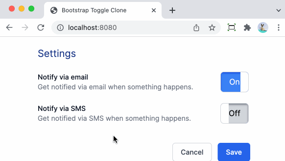
This is how it looks in action:
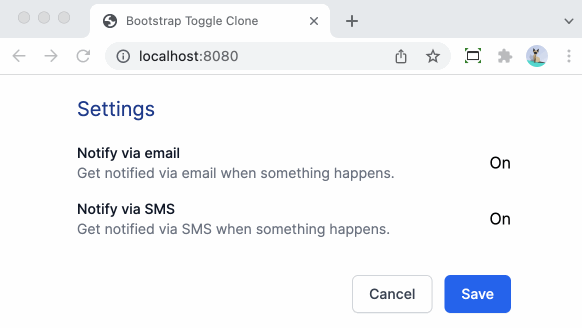
While this visually toggles between 2 states, it does not reflect the actual value, nor does it send the actual value back when the form is submitted.
To initialize our custom component with the value that the hidden checkbox input has, we need to initialize the open variable that we define in the Alpine scope using x-data with the value of the checked attribute that Thymeleaf adds to the input.
In Alpine, we can give elements a reference by using the x-ref attribute.
We can now update the component like this:
<div x-data="{ open: $refs.hc.checked }" (2)
     @click="open = !open"
     class="cursor-pointer">
    <input type="checkbox" th:field="*{__${propertyName}__}"
           x-ref="hc" (1)
           class="hidden">
    <div class=""
         x-text="open?'On':'Off'">On
    </div>
</div>| 1 | Allow to use hc as a name to reference the <input> |
| 2 | Get the checked property of the hc reference to initialize the open variable. |
This will already initialize correctly, but it does not send the new value back yet.
For that, we use the x-model attribute of Alpine that allows binding a variable to the value of the input:
    <div x-data="{ open: $refs.hc.checked }"
         @click="open = !open"
         class="cursor-pointer">
        <input type="checkbox" th:field="*{__${propertyName}__}"
               x-model="open"(1)
               x-ref="hc"
               class="hidden">
        <div class=""
             x-text="open?'On':'Off'">On
        </div>
</div>| 1 | Use x-model to bind the open variable to the value of the <input> |
Now that we have things working functionally again, let’s turn our attention to making it look better.
Improving the looks
We’ll start by adding a background color. Blue when active, gray when inactive.
Alpine makes this quite easy by using :class which allows adding and removing CSS classes when a variable changes:
<div x-data="{ open: $refs.hc.checked }"
     @click="open = !open"
     class="cursor-pointer">
    <input type="checkbox" th:field="*{__${propertyName}__}"
           x-model="open"
           x-ref="hc"
           class="hidden">
    <div class="w-14 h-10 flex justify-center items-center" (1)
         x-text="open?'On':'Off'"
         :class="open?'bg-blue-500 text-white':'bg-gray-300 text-black'"(2)
>On
    </div>
</div>| 1 | Add a fixed size (w-14 h-10) and ensure the text will be centered (flex justify-center items-center) |
| 2 | If the open variable is true, add the bg-blue-500 text-white classes, if false, add bg-gray-300 text-black. |
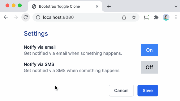
Note how the background and text color change when clicking.
The Bootstrap Toggle however does not switch in place, but it slides between the 2 states. This is what we will do next.
Adding the slide animation
To make the slide animation possible, we need to position the "On" and the "Off" next to each other.
If they are exactly the same size, and we put a kind of peephole on top that only shows the one or the other while it slides under that, we will have a nice transition.
Using overflow-hidden we can hide the one that should not be visible.
This is the code that does this:
<div x-data="{ open: $refs.hc.checked }"
     @click="open = !open"
     class="w-14 h-10 overflow-hidden flex items-center justify-start cursor-pointer">(1)
    <input type="checkbox" th:field="*{__${propertyName}__}"
           x-model="open"
           x-ref="hc"
           class="hidden">
    <div class="flex flex-none justify-start select-none">(2)
        <div class="w-14 h-10 flex justify-center items-center bg-blue-500 text-white hover:bg-blue-700" (3)
             :class="open?'':'-translate-x-full'" (4)
>On
        </div>
        <div class="w-14 h-10 flex justify-center items-center bg-gray-300 text-black hover:bg-gray-400" (5)
             :class="open?'':'-translate-x-full'" (6)
>Off
        </div>
    </div>
</div>| 1 | We ensure a fixed size of w-14 h-10 here which will be our "peephole". We add overflow-hidden to ensure the part that should not be seen remains hidden. |
| 2 | This <div> allows to position the "On" and the "Off" child divs left/right of each other. |
| 3 | We can add the blue background and white text fixed now. We also added a hover:bg-blue-700 to have a nice hover effect. |
| 4 | When the variable open is true, we want to have this <div> visible. If not, we want to move it to the left a full width via -translate-x-full. |
| 5 | Add the gray background and black text now fixed on this <div>. |
| 6 | Also translate the <div> fully to the left when open is false so this second diff comes into view. |
If you try this out, you will not see much difference visually, because we still have to add an actual animation so the slide becomes visible.
To better understand what is going on, I removed the overflow-hidden temporarily for this demo:
Adding the slide animation is quite easy using the Tailwind CSS utility classes. Just add transition-all ease-in-out duration-300 to the <div> 's that are being translated horizontally and we get this nice effect:

One thing that is not so nice is that all toggles start in the "On" state and those that are "Off" animate to that state on page load. It would be nicer if they would show directly in the proper state.
To be able to do that, we will need to have Thymeleaf apply the proper -translate-x-full so it is in place directly and have Alpine update that when we click to toggle:
<div x-data="{ open: $refs.hc.checked }"
     @click="open = !open"
     class="w-14 h-10 overflow-hidden flex items-center justify-start cursor-pointer">
    <input type="checkbox" th:field="*{__${propertyName}__}"
           x-model="open"
           x-cloak
           x-ref="hc"
           class="hidden">
    <div class="flex flex-none justify-start select-none">
        <div class="w-14 h-10 flex justify-center items-center bg-blue-500 text-white hover:bg-blue-700 transition-all ease-in-out duration-300"
             th:classappend="*{__${propertyName}__}?'':'-translate-x-full'" (1)
             :class="{'-translate-x-full':!open}" (2)
>On
        </div>
        <div class="w-14 h-10 flex justify-center items-center bg-gray-300 text-black hover:bg-gray-400 transition-all ease-in-out duration-300"
             th:classappend="*{__${propertyName}__}?'':'-translate-x-full'"
             :class="{'-translate-x-full':!open}">Off
        </div>
    </div>
</div>| 1 | Add th:classappend to have Thymeleaf append the -translate-x-full to the class attribute when the value of the property is false |
| 2 | Use object-syntax to ensure Alpine will remove the -translate-x-full that Thymeleaf has added. See Class object syntax for more info. |
If you test now again, you’ll see that the page shows properly now on the initial load.
Extra styling
To get closer to the look of Bootstrap Toggle, we need to add a bit of shadow and a kind of handle.
Let’s start with the shadows:
<div x-data="{ open: $refs.hc.checked }"
     @click="open = !open"
     class="w-14 h-10 rounded-md overflow-hidden flex items-center justify-start cursor-pointer"> (1)
    <input type="checkbox" th:field="*{__${propertyName}__}"
           x-model="open"
           x-cloak
           x-ref="hc"
           class="hidden">
    <div class="flex flex-none justify-start select-none">
        <div class="w-14 h-10 flex justify-center items-center bg-blue-500 text-white hover:bg-blue-600
                        transition-all ease-in-out duration-300
                        shadow-inner shadow-blue-700" (2)
             th:classappend="*{__${propertyName}__}?'':'-translate-x-full'"
             :class="{'-translate-x-full':!open}">On
        </div>
        <div class="w-14 h-10 flex justify-center items-center bg-gray-300 text-black hover:bg-gray-400
                        transition-all ease-in-out duration-300
                        shadow-inner shadow-gray-500" (3)
             th:classappend="*{__${propertyName}__}?'':'-translate-x-full'"
             :class="{'-translate-x-full':!open}">Off
        </div>
    </div>
</div>| 1 | Add rounded-md to have rounded corners |
| 2 | Add shadow-inner shadow-blue-700 for our "On" state shadows |
| 3 | Add shadow-inner shadow-gray-500 for our "Off" state shadows |
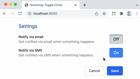
In action:
For the handle, we’ll add an absolute positioned div stuck to the right (if "On") or the left (if "Off").
To add to the effect, we will also add a gray border.
However, that border gets clipped, so we need to wrap the whole thing in another div with a p-1 so there is some room to display the extra border:
<div class="flex justify-center items-center p-1"> (1)
<div x-data="{ open: $refs.hc.checked }"
@click="open = !open"
class="w-14 h-10 rounded-md overflow-hidden flex items-center justify-start cursor-pointer
relative bg-blue-500 ring-1 ring-gray-300"> (2)
<input type="checkbox" th:field="*{__${propertyName}__}"
x-model="open"
x-cloak
x-ref="hc"
class="hidden">
<div class="flex flex-none justify-start select-none">
<div class="w-14 h-10 flex justify-center items-center bg-blue-500 text-white hover:bg-blue-600
transition-all ease-in-out duration-300
shadow-inner shadow-blue-700"
th:classappend="*{__${propertyName}__}?'':'-translate-x-full'"
:class="{'-translate-x-full':!open}">
<div>On</div> (3)
<div class="absolute inset-y-0 right-0 w-4 h-10 bg-white" (4)
:class="open ? '' : 'hidden'" (5)
> </div>
</div>
<div class="w-14 h-10 flex justify-center items-center bg-gray-300 text-black hover:bg-gray-400
transition-all ease-in-out duration-300
shadow-inner shadow-gray-500"
th:classappend="*{__${propertyName}__}?'':'-translate-x-full'"
:class="{'-translate-x-full':!open}">
<div>Off</div>
<div class="absolute inset-y-0 left-0 w-4 h-10 bg-white" (6)
:class="open ? 'hidden' : ''">
</div>
</div>
</div>
</div>
</div>| 1 | Extra wrapping div to have some padding (p-1 class). |
| 2 | relative class so that the absolute position will be relative to this element.
ring-1 ring-gray-300 adds a single-pixel gray border. |
| 3 | New nested <div> with the text. |
| 4 | New nested <div> for the handle that is absolutely positioned on the right (inset-y-0 right-0). |
| 5 | Hide the handle depending on the value of the open variable. |
| 6 | New nested <div> for the handle that is absolutely positioned on the left (inset-y-0 left-0). |
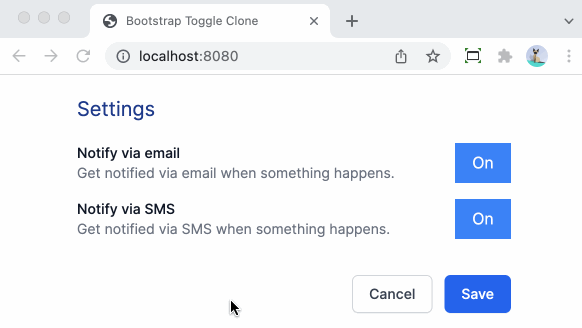
The final result:
Conclusion
Using Tailwind CSS and Alpine, we can build rich custom components like the Bootstrap Toggle component. And we did not need to write a single line of JavaScript to make it happen.
See bootstraptoggleclone on GitHub for the full sources of this example.
If you have any questions or remarks, feel free to post a comment at GitHub discussions.
If you want to be notified in the future about new articles, as well as other interesting things I'm working on, join my mailing list!
I send emails quite infrequently, and will never share your email address with anyone else.