After creating a Thymeleaf component library, building a component and adding support for slots, we will now turn our attention to adding client-side interactivity to a component.
AlpineJS
We could use JavaScript to add interactivity by adding it to src/main/resources/static/js/tcl.js directly, or import a script there.
However, I like to use AlpineJS instead.
I find the reactive and declarative style real easy to work with.
Add the following dependencies to the pom.xml:
    <dependency>
      <groupId>org.webjars</groupId>
      <artifactId>webjars-locator-lite</artifactId>
    </dependency>
    <dependency>
      <groupId>org.webjars.npm</groupId>
      <artifactId>alpinejs</artifactId>
      <version>${alpinejs.version}</version>
    </dependency>
    <dependency>
      <groupId>org.webjars.npm</groupId>
      <artifactId>alpinejs__focus</artifactId>
      <version>${alpinejs.version}</version>
    </dependency>
Add the alpinejs.version property in the <properties> section of the pom.xml like this:
<alpinejs.version>3.15.12</alpinejs.version>This allows to reference AlpineJS via Webjars. It ensures we serve the JavaScript library from our own domain, and not from a CDN.
To make it easy for the users of our component library to use AlpineJS, we will add a webjars fragment that will include the necessary scripts in the page:
<th:block th:fragment="webjars">
  <script type="text/javascript" th:src="@{/webjars/alpinejs__focus/dist/cdn.min.js}"></script>
  <script type="text/javascript" th:src="@{/webjars/alpinejs/dist/cdn.min.js}"></script>
</th:block>
The dialog component
We will now create a dialog component that uses AlpineJS for interactivity.
<!doctype html>
<html xmlns:th="http://www.thymeleaf.org" xmlns:tcl="http://www.w3.org/1999/xhtml">
<body>
<div
    th:fragment="dialog"
    th:with="
        title=${attrs != null and attrs.containsKey('title') ? attrs.get('title') : null},
        confirmationButtonLabel=${attrs != null and attrs.containsKey('confirmationButtonLabel') ? attrs.get('confirmationButtonLabel') : 'Ok'},
        cancelButtonLabel=${attrs != null and attrs.containsKey('cancelButtonLabel') ? attrs.get('cancelButtonLabel') : 'Cancel'}"
    class="tcl-dialog"
    x-data="{
      dialogOpen: true,
      cancel() {
        this.dialogOpen = false;
        this.$dispatch('dialog-cancelled');
      },
      confirm() {
        this.dialogOpen = false;
        this.$dispatch('dialog-confirmed');
      }
    }"
    x-show="dialogOpen"
    x-trap="dialogOpen"
    @keydown.escape.window="cancel()"
    @keydown.enter.window="confirm()"
    tcl:attrsExcept="title,confirmationButtonLabel,cancelButtonLabel"
>
  <div class="tcl-dialog-overlay"></div>
  <div class="tcl-dialog-window" @click.outside="cancel()">
    <div th:if="${title != null}" class="tcl-dialog-titlebar">
      <span class="tcl-dialog-title" th:text="${title}">Title</span>
      <div class="tcl-dialog-titlebar-actions">
        <div @click="cancel()">
          <svg viewBox="0 0 24 24">
            <path
                d="M19.72 18.86a.607.607 0 1 1-.858.858l-6.861-6.859-6.86 6.859a.607.607 0 0 1-.859-.858L11.141 12 4.282 5.14a.607.607 0 0 1 .859-.86l6.86 6.86 6.861-6.86a.607.607 0 0 1 .858.86L12.86 12z"/>
          </svg>
        </div>
      </div>
    </div>
    <div class="tcl-dialog-content">
      <tcl:slot>Dialog content</tcl:slot>
    </div>
    <div class="tcl-dialog-actions">
      <tcl:button @click="cancel()">[[${cancelButtonLabel}]]</tcl:button>
      <tcl:button primary @click="confirm()">[[${confirmationButtonLabel}]]</tcl:button>
    </div>
  </div>
</div>
</body>
</html>
There is quite a bit going on in this component, so let’s go through it step by step.
-
th:fragment="dialog"→ name of the fragment. -
th:with→ we define some local variables that we will use in the component. We check if theattrsmap contains a value for the title, confirmation button label and cancel button label. If not, we use default values. -
class="tcl-dialog"→ we add a CSS class to the root element of the component. This allows us to style the component using CSS. -
x-data→ we define a local AlpineJS component with some state and methods. ThedialogOpenstate variable is used to control the visibility of the dialog. Thecancelandconfirmmethods are used to close the dialog and dispatch events to the parent component. -
x-show→ we use thedialogOpenstate variable to control the visibility of the dialog. WhendialogOpenistrue, the dialog is visible. When it isfalse, the dialog is hidden. -
x-trap→ we use thex-trapdirective to trap the focus inside the dialog when it is open. This is important for accessibility. -
@keydown.escape.windowand@keydown.enter.window→ we listen for the escape and enter keys to close the dialog. When the escape key is pressed, we call thecancelmethod. When the enter key is pressed, we call theconfirmmethod. -
tcl:attrsExcept→ we use this attribute to pass all attributes except the ones we defined inth:withto the root element of the component. This allows us to pass additional attributes to the dialog, such asid,class, etc. -
The rest of the component is just HTML and Thymeleaf syntax to render the dialog content, title, and buttons. We use the
tcl:slotelement to allow the user to pass in custom content for the dialog. We also use thetcl:buttoncomponent we created in part 2 to render the buttons.
The dialog is styled using this CSS:
.tcl-dialog {
  z-index: 10001;
  align-items: center;
  justify-content: center;
  display: flex;
  flex-direction: column;
  position: fixed;
  top: 0;
  left: 0;
  width: 100%;
  height: 100%;

  .tcl-dialog-overlay {
    opacity: 0.32;
    background-color: #000000f5;
    position: fixed;
    top: 0;
    left: 0;
    width: 100%;
    height: 100%;
  }

  .tcl-dialog-window {
    border-radius: 0.5rem;
    position: relative;
    background-color: white;

    .tcl-dialog-titlebar {
      display: flex;
      flex-direction: row;
      flex-shrink: 0;
      align-items: center;
      gap: 0.75rem;
      padding-block: 1.5rem 1rem;
      padding-inline: 1.5rem;
      border-bottom: 1px solid #d97706;

      .tcl-dialog-title {
        width: 100%;
        flex-basis: 0;
        flex-grow: 1;
        flex-shrink: 1;
        overflow-x: hidden;
        overflow-y: hidden;
        font-weight: bold;
        padding: 0.5rem 0;
      }

      .tcl-dialog-titlebar-actions {
        div {
          padding-right: 5px;
          padding-left: 5px;

          svg {
            width: 1rem;
            height: 1rem;
            padding: 0.25rem;
            cursor: pointer;

            &:hover {
              background-color: #d97706;
            }
          }

        }
      }
    }

    .tcl-dialog-content {
      padding: 1rem;
      min-height: 25px;
      overflow: auto;
      position: relative;
      flex: 1 1 auto;
    }

    .tcl-dialog-actions {
      display: flex;
      flex-flow: row wrap;
      flex: 0 0 auto;
      align-items: center;
      gap: 0.75rem;
      border-top: 1px solid #d97706;
      padding: 1.5rem;

      * {
        flex: 1 0 0;
      }
    }
  }
}
Don’t forget to import it in the main tcl.css file:
@import 'button.css';
@import 'dialog.css';
That is it for the dialog component.
We can now render a dialog using tcl:dialog and we can react to the dialog-confirmed and dialog-cancelled events that are dispatched by the component.
Using the dialog component
We need a few bits in place to use the dialog component in our application.
-
Something that triggers the dialog to open. In this case, we will use a button.
-
A place to render the dialog. We will use a
divwith anidofmodal-root. -
The dialog itself, which we will render using the
tcl:dialogcomponent inside a fragment in the application. -
The action that is executed when the dialog is confirmed.
We can add our triggering button to index.html for testing:
<tcl:button primary hx:get="@{/users/123}" hx-target="#modal-root">Delete user 123</tcl:button>We will use htmx to load the dialog component into the modal-root div when the button is clicked.
The hx:get attribute specifies the URL to fetch, and the hx-target attribute specifies where to render the response.
Update layout/main.html to have an empty div where the dialog can be rendered:
...
  <main layout:fragment="content">
  </main>
  <div id="modal-root"></div> (1)
  <th:block th:replace="~{tcl/layout :: webjars}"></th:block> (2)
...| 1 | Empty div where the dialog can be rendered. |
| 2 | Include the webjars fragment we created earlier, so that AlpineJS is available in the page. |
Now for the dialog itself, we create a fragments/dialog.html file in the application that will render the dialog component:
<!DOCTYPE html>
<html lang="en"
      xmlns:th="http://www.thymeleaf.org">
<body>
<div th:fragment="delete-dialog(title, message, id)">
  <tcl:dialog title="Delete user"
              confirmationButtonLabel="Delete"
              hx-trigger="dialog-confirmed"
              hx:delete="@{/users/{id}(id=${id})}">[[${message}]]</tcl:dialog>
</div>
</body>
</html>
We set hx-trigger to dialog-confirmed, which is the event that is dispatched by AlpineJS when the user clicks the confirmation button in the dialog.
We also set hx:delete to the URL that will delete the user.
The combination of those two attributes will ensure that when the user clicks the confirmation button, the dialog will be closed and a DELETE request will be sent to the server.
The message variable is put in the default slot of the dialog component, so it will be rendered in the content area of the dialog.
As it is a slot, we could place any HTML content in there, but for this example we will just use a simple message.
Finally, we need a controller method that will return this fragment when the button is clicked, and a method that will handle the DELETE request when the user confirms the deletion:
package com.wimdeblauwe.examples.tcl.tcl_sample_01;

import io.github.wimdeblauwe.htmx.spring.boot.mvc.HtmxRedirectView;
import io.github.wimdeblauwe.htmx.spring.boot.mvc.HxRequest;
import org.springframework.stereotype.Controller;
import org.springframework.ui.Model;
import org.springframework.web.bind.annotation.DeleteMapping;
import org.springframework.web.bind.annotation.GetMapping;
import org.springframework.web.bind.annotation.PathVariable;
import org.springframework.web.bind.annotation.RequestMapping;

@RequestMapping("/users")
@Controller
public class UserController {

  @GetMapping("/{id}")
  public String showDeleteDialog(@PathVariable String id, Model model) { (1)
    model.addAttribute("message", "Are you sure you want to delete user '%s'?".formatted(id));
    model.addAttribute("id", id);

    return "fragments/dialogs :: delete-dialog"; (2)
  }

  @HxRequest
  @DeleteMapping("/{id}")
  public HtmxRedirectView deleteUser(@PathVariable String id, Model model) { (3)
    // Delete the user via a service or use case here

    return new HtmxRedirectView("/");
  }
}| 1 | This method is called when the user clicks the button to delete a user.
It adds the message and id to the model, and returns the delete-dialog fragment. |
| 2 | We can reference a specific fragment in a template by using the :: syntax.
In this case, we are referencing the delete-dialog fragment in the fragments/dialogs.html template. |
| 3 | This method is called when the user confirms the deletion of the user. It deletes the user and returns a redirect to the home page. |
The nice thing about using htmx to display the dialog is: we have full access to the backend services to show additional information in the dialog, such as the name of the user to be deleted.
Suppose this is a table of users, each with a delete button. If you would fully handle this client side, then there needs to be a template of the dialog already present in the html, and you need to pass the user information to the dialog via JavaScript. This is not a big deal (I have an example of this in Taming Thymeleaf) , but it is a bit more work than just letting the backend render the dialog with the correct information.
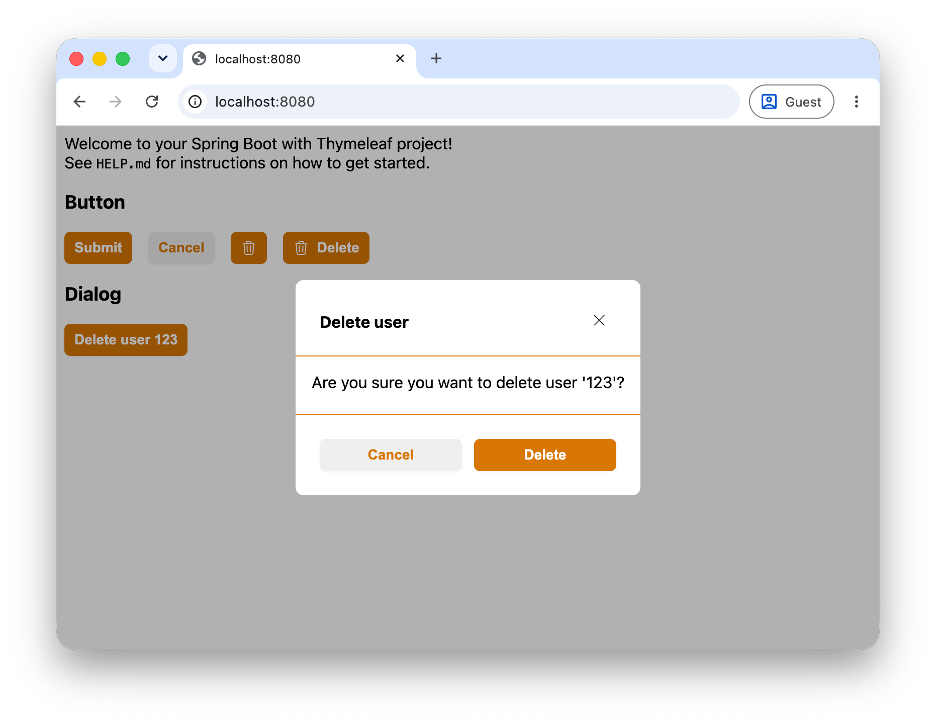
The result in the browser should look like this:
Conclusion
This was the last part of the series on writing a Thymeleaf component library.
The series showed that it is possible to create a component library for Thymeleaf, and that it is not that hard to do. From this point on, you can start creating your own components and use them in your applications.
See thymeleaf-component-library on GitHub for the full sources of these examples.
If you have any questions or remarks, feel free to post a comment at GitHub discussions.