This blog post is the first in a series showing how to build a Spring Boot with Thymeleaf application using the Shadleaf component library. Over the course of 10 parts, we will build Spendleaf, an expense tracker for a small team. Employees enter expenses and attach receipts, and managers approve or reject them.
The app touches almost every part of Shadleaf: the application shell, tables, forms, dialogs and sheets, file uploads, roles and charts.
This is a mockup that shows the design direction of the finished application:
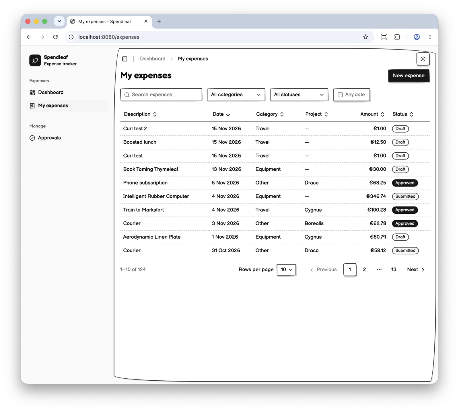
In this first part, we will set up the project and create the application shell.
Setup
Install ttcli if you don’t have it yet and run it to quickly start your Spring Boot with Thymeleaf project:
ttcli init \
    --group com.wimdeblauwe.examples \
    --artifact spendleaf \
    --name Spendleaf \
    --java-version 25 \
    --boot-version 4.1.2 \
    --template-engine thymeleaf \
    --thymeleaf-layout-dialect no \
    --package-manager pnpm \
    --live-reload vite \
    --web-deps shadleaf,htmx,tailwind-css \
    --htmx-version 4 \
    --tailwind-version 4 \
    --non-interactive
This builds the following scaffolding:
├── HELP.md
├── mvnw
├── mvnw.cmd
├── package.json
├── pnpm-lock.yaml
├── pnpm-workspace.yaml
├── pom.xml
├── src
│   ├── main
│   │   ├── java
│   │   │   └── com
│   │   │       └── wimdeblauwe
│   │   │           └── examples
│   │   │               └── spendleaf
│   │   │                   ├── HomeController.java
│   │   │                   └── SpendleafApplication.java
│   │   └── resources
│   │       ├── application-local.properties
│   │       ├── application.properties
│   │       ├── static
│   │       │   └── css
│   │       │       └── application.css
│   │       └── templates
│   │           ├── index.html
│   │           └── layout
│   │               └── main.html
│   └── test
│       └── java
│           └── com
│               └── wimdeblauwe
│                   └── examples
│                       └── spendleaf
│                           └── SpendleafApplicationTests.java
└── vite.config.js
The Maven pom.xml has the following dependencies:
-
vite-spring-boot-thymeleaf: This supports the live reload development flow. -
shadleaf-spring-boot-starter: The Shadleaf component library. -
The
htmx.orgwebjar andhtmx-spring-boot-thymeleaf: I cannot imagine building a Thymeleaf application without htmx. We will use the latest htmx 4.
The scaffolding also has an index.html which is mostly empty, but shows how to use the main layout:
<!DOCTYPE html>
<html lang="en"
      xmlns:th="http://www.thymeleaf.org"
      th:replace="~{layout/main :: layout(content=~{::#content},scriptContent=~{::#script-content})}">
<body>
<div id="content">
    <!-- Add content here -->
    <div>Welcome to your Spring Boot with Thymeleaf project!</div>
    <div>See <code>HELP.md</code> for instructions on how to get started.</div>
</div>
<th:block id="script-content">
    <!-- Add additional scripts there that are only needed for this page (Application wide scripts should be added in layout/main.html) -->
</th:block>
</body>
</html>
The layout/main.html looks like this:
<!DOCTYPE html>
<html th:lang="|${#locale.language}-${#locale.country}|"
      xmlns:th="http://www.thymeleaf.org"
      xmlns:sl="https://shadleaf.dev/sl"
      th:fragment="layout(content)"
      th:with="title=${title} ?: ~{::title},scriptContent=${scriptContent} ?: ~{}">
<head>
    <meta charset="UTF-8">
    <meta name="viewport" content="width=device-width, initial-scale=1">
    <th:block th:replace="${title}"></th:block>
    <th:block th:replace="~{sl/layout :: theme-script}"></th:block> (1)
    <th:block th:replace="~{sl/layout :: assets}"></th:block> (2)
    <vite:client></vite:client>
    <vite:vite>
        <vite:entry value="/css/application.css"></vite:entry> (3)
    </vite:vite>

    <script defer th:src="@{/webjars/htmx.org/dist/htmx.min.js}"></script> (4)
</head>
<body>
<header>
    <sl:theme-toggle></sl:theme-toggle> (5)
    <sl:button variant="outline">Example button</sl:button> (6)
</header>
<main th:replace="${content}">
</main>

<th:block th:replace="${scriptContent}">

</th:block>
</body>
<template>
    <title>My application</title>
</template>
</html>| 1 | The theme-script block supports toggling light and dark mode. |
| 2 | The assets block inserts the CSS and JavaScript links for Shadleaf. |
| 3 | The <vite:entry> points at the CSS for our application itself. |
| 4 | Add the htmx webjar script so we can use htmx later. |
| 5 | Use the sl:theme-toggle component to add a button that lets the user switch between light and dark mode. |
| 6 | This line adds a button, just as an example of a component. |
Because we use Tailwind CSS for the application’s own CSS, ttcli sets shadleaf.assets.variant to embedded:
spring.application.name=Spendleaf
vite.mode=build

shadleaf.assets.variant=embedded
Ttcli also ensures our base CSS is set up correctly:
@import "tailwindcss";
@source "../../templates";

/* Make `dark:` follow the Shadleaf theme toggle instead of the operating system */
@custom-variant dark (&:where(.dark, .dark *));

/* Utilities on Shadleaf's tokens (e.g. `bg-primary`, `text-muted-foreground`) */
@theme inline {
  --radius-sm: calc(var(--radius) - 4px);
  --radius-md: calc(var(--radius) - 2px);
  --radius-lg: var(--radius);
  --radius-xl: calc(var(--radius) + 4px);
  --color-background: var(--background);
  --color-foreground: var(--foreground);
  --color-card: var(--card);
  --color-card-foreground: var(--card-foreground);
  --color-popover: var(--popover);
  --color-popover-foreground: var(--popover-foreground);
  --color-primary: var(--primary);
  --color-primary-foreground: var(--primary-foreground);
  --color-secondary: var(--secondary);
  --color-secondary-foreground: var(--secondary-foreground);
  --color-muted: var(--muted);
  --color-muted-foreground: var(--muted-foreground);
  --color-accent: var(--accent);
  --color-accent-foreground: var(--accent-foreground);
  --color-destructive: var(--destructive);
  --color-border: var(--border);
  --color-input: var(--input);
  --color-ring: var(--ring);
}

/* Page background and borders in the colours of the Shadleaf components */
@layer base {
  body {
    background-color: var(--background);
    color: var(--foreground);
  }

  * {
    border-color: var(--border);
  }
}
To check that everything works, start the live reload server:
pnpm run devThen, in a new terminal, start the Spring Boot application:
./mvnw spring-boot:run -Dspring-boot.run.profiles=localOpen http://localhost:8080 in your browser:
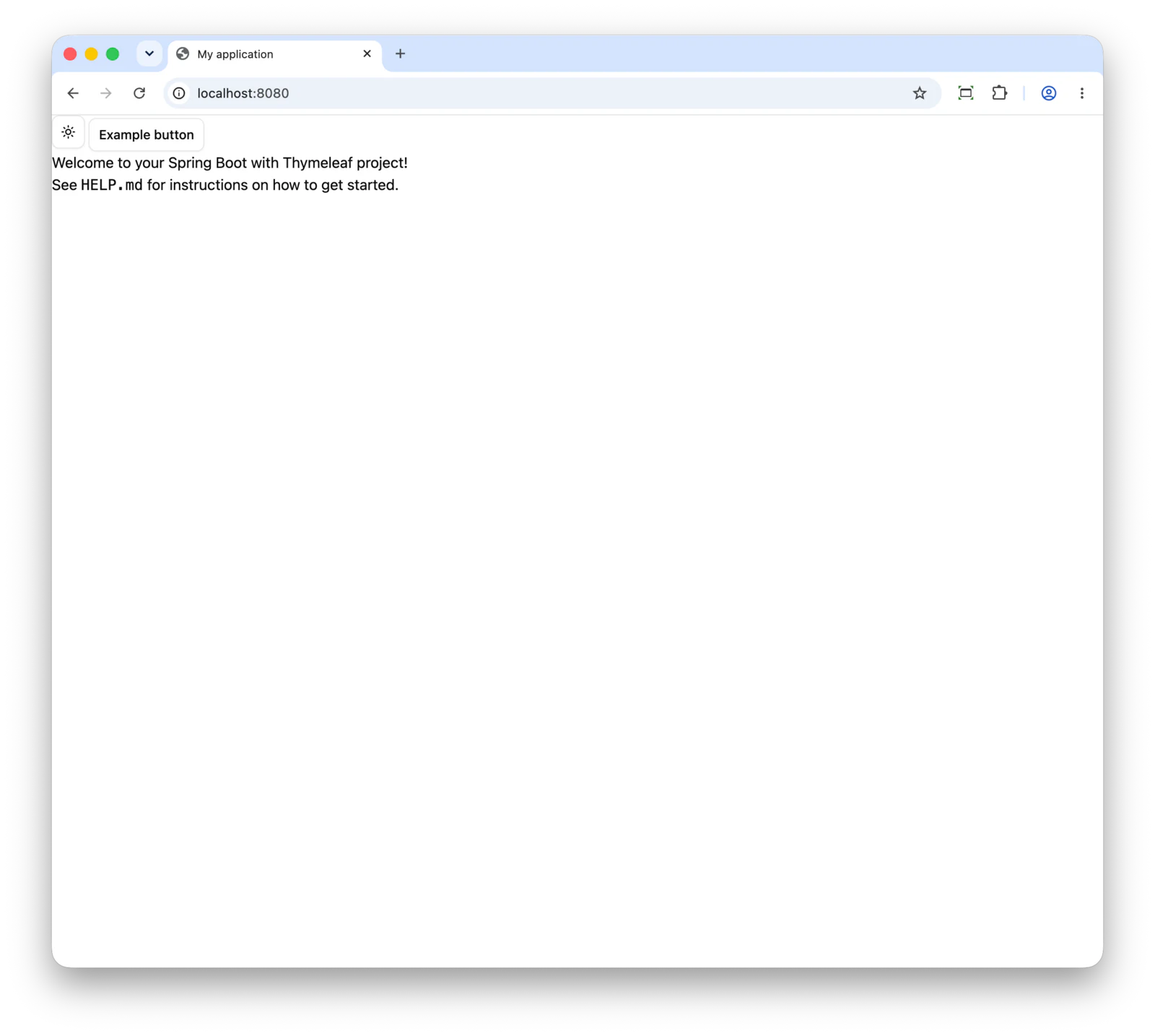
Now check that live reload works by adding something to index.html.
For example:
<div class="text-2xl text-red-300">Shadleaf Test</div>Saving the change is enough for the browser to reload.
|
If you start the Spring Boot application from IntelliJ IDEA, enable the The |
Application shell
The application needs a basic structure with a navigation part and a main content part.
Shadleaf has many example layouts you can choose from. We will use collapses-to-icons here.
It uses this structure:
  <body>
   └─ sl:skip-link
   └─ sl:sidebar-provider          ← wraps everything, holds expanded/collapsed state
       ├─ sl:sidebar               ← the <nav>: header, content (menus), footer
       └─ sl:sidebar-inset         ← the page's <main id="main">
           ├─ sl:site-header       ← row with trigger, separator, breadcrumb, theme toggle
           │    └─ sl:sidebar-trigger
           └─ your page content
This is what each part does:
-
<sl:sidebar-provider>wraps the whole page and keeps track of whether the sidebar is expanded or collapsed on a desktop. The current setting is automatically stored in a cookie. Keyboard users can use Ctrl/⌘+B to toggle it. -
<sl:sidebar>is the navigation itself, rendered as a<nav>landmark. It has three parts:sidebar-header(logo or app name),sidebar-content(groups and menus) andsidebar-footer(the user menu). It must be a direct child of the provider, because the CSS that collapses it looks for it there. Two props are important for Spendleaf:-
variant="inset"shows the page as a card next to the sidebar. -
collapsible="icon"collapses the sidebar to a strip of icons with tooltips. The alternative,collapsible="offcanvas", slides it out of view instead.
-
-
<sl:sidebar-inset>renders the page’s single<main id="main" tabindex="-1">. That is also the target of the skip link, so all page content goes inside it. -
<sl:site-header>is a header that lays out its children in a row. It has an end slot for things that belong on the right, like the theme toggle. Inside the inset, it holds the<sl:sidebar-trigger>(the button that collapses the sidebar on a desktop and opens it as a panel on a phone), a vertical separator and the breadcrumb.
Below 768 px, the same <sl:sidebar> element opens as a panel over the page, so you don’t need separate mobile markup.
The sl:skip-link is a component that stays hidden until focused.
It allows a keyboard user to jump directly to the main content without having to go through all the navigation items each time.
Using this structure, we now have this layout/main.html:
<!DOCTYPE html>
<html lang="en" xmlns:th="http://www.thymeleaf.org" xmlns:sl="https://shadleaf.dev/sl"
      th:fragment="layout(pageTitle, breadcrumb, content)">
<head>
    <meta charset="UTF-8">
    <meta name="viewport" content="width=device-width, initial-scale=1">
    <title th:text="|${pageTitle} - Spendleaf|">Spendleaf</title>
    <th:block th:replace="~{sl/layout :: theme-script}"></th:block>
    <th:block th:replace="~{sl/layout :: assets}"></th:block>
    <vite:client></vite:client>
    <vite:vite>
        <vite:entry value="/css/application.css"></vite:entry>
    </vite:vite>
    <script defer th:src="@{/webjars/htmx.org/dist/htmx.min.js}"></script>
</head>
<body>
<sl:skip-link/>
<sl:sidebar-provider>
    <sl:sidebar variant="inset" collapsible="icon">
        <sl:sidebar-header>
            <!-- application name -->
        </sl:sidebar-header>
        <sl:sidebar-content>
            <!-- menu items -->
        </sl:sidebar-content>
    </sl:sidebar>
    <sl:sidebar-inset>
        <sl:site-header>
            <sl:sidebar-trigger/>
            <sl:separator orientation="vertical"/>
            <sl:breadcrumb>
                <sl:breadcrumb-list>
                    <th:block th:replace="${breadcrumb}"></th:block>
                </sl:breadcrumb-list>
            </sl:breadcrumb>
            <sl:slot name="end">
                <sl:theme-toggle/>
            </sl:slot>
        </sl:site-header>
        <div class="px-4 pb-4">
            <h1 class="mb-4 text-2xl font-semibold" th:text="${pageTitle}"></h1>
            <div th:replace="${content}"></div>
        </div>
    </sl:sidebar-inset>
</sl:sidebar-provider>
</body>
</html>
Note how we don’t need to style any of the Shadleaf components.
We do have a little bit of Tailwind CSS styling for the <h1> and some padding around the content.
Update index.html to use the new layout:
<html xmlns:th="http://www.thymeleaf.org" xmlns:sl="https://shadleaf.dev/sl"
th:replace="~{layout/main :: layout('Dashboard', ~{::breadcrumb}, ~{::#page-content})}">
<body>
<th:block th:ref="breadcrumb">
    <sl:breadcrumb-item>
        <sl:breadcrumb-page>Dashboard</sl:breadcrumb-page>
    </sl:breadcrumb-item>
</th:block>
<div id="page-content">
    Dashboard content
</div>
</body>
</html>
The index injects 2 parts of html into the layout.
The breadcrumb uses th:ref so we can refer to that html snippet using ~{::breadcrumb}.
Using th:ref avoids that the resulting html that Thymeleaf renders has any indication of the reference.
For the page content, we add an id of page-content, so we can use ~{::#page-content}) to refer to it.
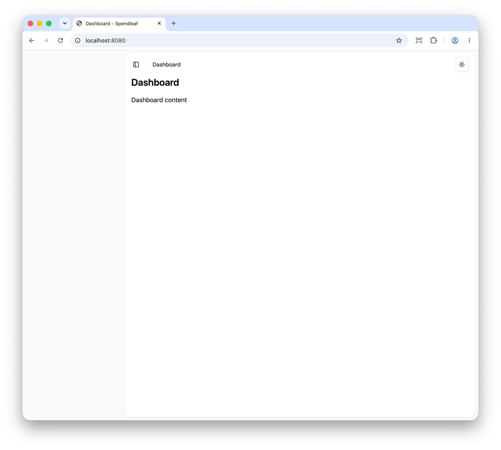
This gives the following result:
Navigation
We can now fill in the navigation part on the left.
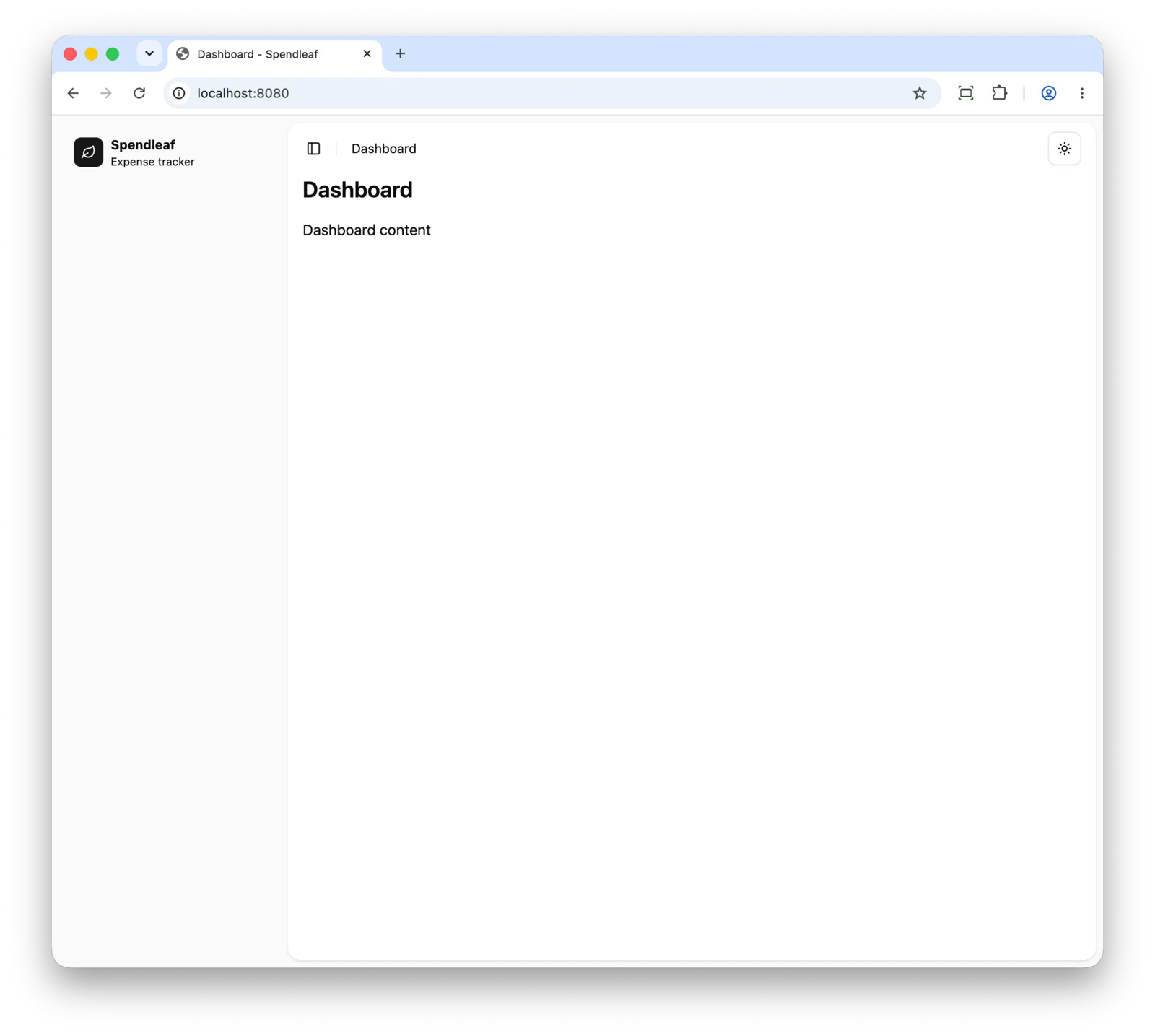
Application name
We will start with the application name and icon.
Inside the <sl:sidebar-header>, we put the following snippet:
<sl:sidebar-menu>
    <sl:sidebar-menu-item>
        <sl:sidebar-menu-button th:href="@{/}" size="lg" tooltip="Spendleaf">
            <sl:slot name="icon-start">
                <span class="grid size-8 shrink-0 place-items-center rounded-md bg-primary text-primary-foreground">
                    <sl:icon name="leaf" size="16"/>
                </span>
            </sl:slot>
            <strong>Spendleaf</strong>
            <small>Expense tracker</small>
        </sl:sidebar-menu-button>
    </sl:sidebar-menu-item>
</sl:sidebar-menu>
The sl:sidebar-menu-button is a link, so we give it a th:href link, typically to the root of the application.
With size="lg", we can add two lines of text which we use for the application name (Spendleaf) and the tagline (Expense tracker).
An important concept in Shadleaf is the use of slots.
Many Shadleaf components have slots: named places where you put your own markup. <sl:slot name="icon-start"> puts its content in the icon-start slot of the menu button.
Anything outside a named slot, here the two lines of text, becomes the main content.
You already saw this in the layout, where <sl:slot name="end"> puts the theme toggle at the right of the site header.
In this example, we put an icon into the icon-start slot so it is shown before the application name.
Switch to the icon-end slot if you want the icon to the right of the application name.
Shadleaf has an sl:icon component that contains all Lucide icons.
We use it here as the application icon.
To make it look more like a logo, we surround it with a small colored square:
<span class="grid size-8 shrink-0 place-items-center rounded-md bg-primary text-primary-foreground">
    <sl:icon name="leaf" size="16"/>
</span>
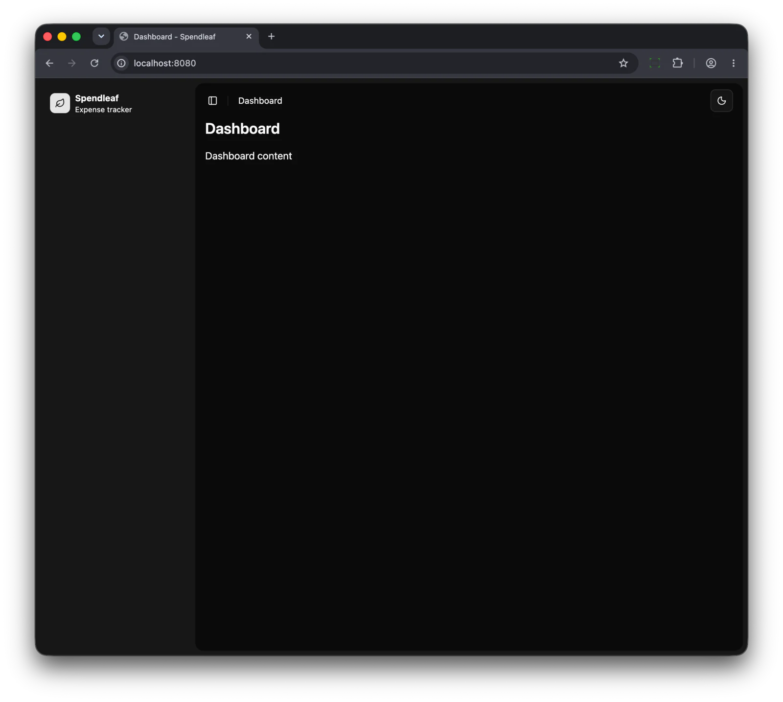
Note how we use bg-primary and text-primary-foreground which uses Shadleaf’s tokens.
Because of that, the square is black in light mode and white in dark mode (with the default theme).
Menu items
The next step is adding the menu items for navigation.
Menu items follow this structure:
  sl:sidebar-content
   └─ sl:sidebar-group (id="…")        ← a named section, e.g. "Expenses"
       ├─ sl:sidebar-group-label       ← heading; screen readers announce "Expenses, group"
       └─ sl:sidebar-group-content
           └─ sl:sidebar-menu          ← a <ul>
               └─ sl:sidebar-menu-item ← an <li>
                   └─ sl:sidebar-menu-button  ← the link: icon slot + label
We can apply this in our example by adding this HTML inside the <sl:sidebar-content> element:
<sl:sidebar-group id="nav-main">
    <sl:sidebar-group-label>Expenses</sl:sidebar-group-label>
    <sl:sidebar-group-content>
        <sl:sidebar-menu>
            <sl:sidebar-menu-item>
                <sl:sidebar-menu-button th:href="@{/}" th:active="${#slNav.current('/')}" tooltip="Dashboard">
                    <sl:slot name="icon-start">
                        <sl:icon name="layout-dashboard"/>
                    </sl:slot>
                    Dashboard
                </sl:sidebar-menu-button>
            </sl:sidebar-menu-item>
            <sl:sidebar-menu-item>
                <sl:sidebar-menu-button th:href="@{/expenses}" th:active="${#slNav.current('/expenses')}"
                                        tooltip="My expenses">
                    <sl:slot name="icon-start">
                        <sl:icon name="receipt"/>
                    </sl:slot>
                    My expenses
                </sl:sidebar-menu-button>
            </sl:sidebar-menu-item>
        </sl:sidebar-menu>
    </sl:sidebar-group-content>
</sl:sidebar-group>
<sl:sidebar-group id="nav-manage">
    <sl:sidebar-group-label>Manage</sl:sidebar-group-label>
    <sl:sidebar-group-content>
        <sl:sidebar-menu>
            <sl:sidebar-menu-item>
                <sl:sidebar-menu-button th:href="@{/approvals}" th:active="${#slNav.current('/approvals')}"
                                        tooltip="Approvals">
                    <sl:slot name="icon-start">
                        <sl:icon name="circle-check"/>
                    </sl:slot>
                    Approvals
                </sl:sidebar-menu-button>
            </sl:sidebar-menu-item>
        </sl:sidebar-menu>
    </sl:sidebar-group-content>
</sl:sidebar-group>
This gives the following result:
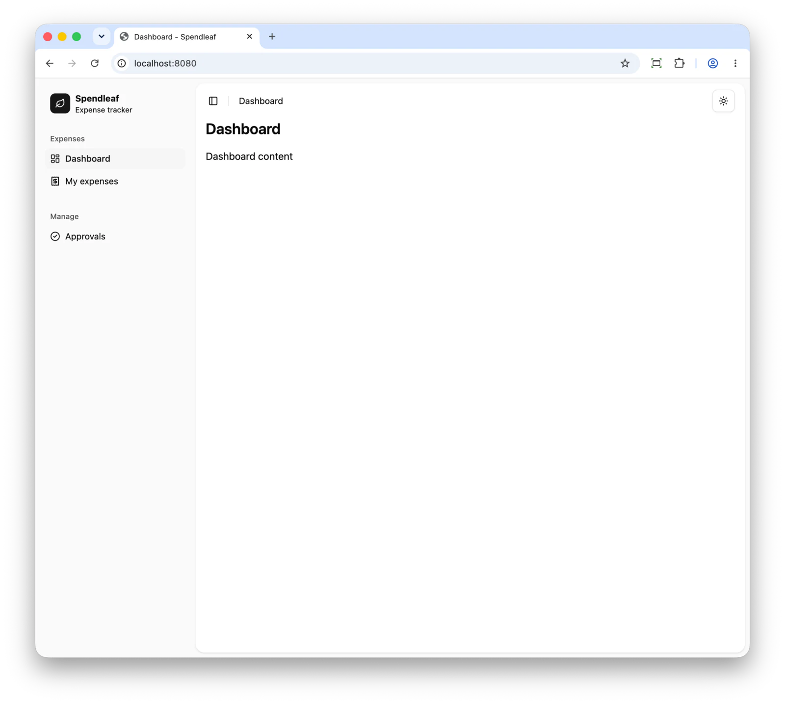
Some important things here:
-
<sl:sidebar-group id="nav-main">: Each sidebar-group optionally takesid. The group uses its id to link its label for screen readers (aria-labelledby="nav-main-label"). Without anid, Shadleaf generates a random one on every render, so the HTML changes on each request. A fixedidkeeps the output stable for tests and gives you a handle for CSS. -
Each
sl:sidebar-menu-buttonhas three attributes:-
th:href="@{/approvals}"points to the URL that should be navigated to. -
th:active="${#slNav.current('/approvals')}"will ensure the menu item is highlighted if the current URL is/approvalsor a sub-path like/approvals/12./is the exception as otherwise Dashboard would be highlighted on every page. -
tooltip="Approvals". The tooltip is useful when the sidebar is collapsed.
-
-
We again use an
sl:slotto add an icon at the start of the menu item.
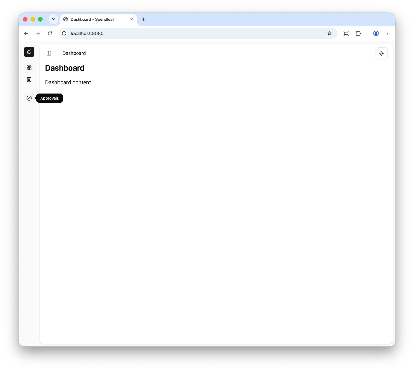
The /expenses and /approvals currently both return a 404, but we will fix that next.
Breadcrumbs
Breadcrumb navigation is a widely used pattern to indicate hierarchy and allow the user to easily navigate back to a page higher up in the hierarchy.
In Shadleaf, each page is responsible for adding the breadcrumb trail correctly. To show how this works, we will add placeholder pages for Expenses and Approvals. Start by adding two controllers:
package com.wimdeblauwe.examples.spendleaf.expense.web;

import org.springframework.stereotype.Controller;
import org.springframework.web.bind.annotation.GetMapping;
import org.springframework.web.bind.annotation.RequestMapping;

@Controller
@RequestMapping("/expenses")
class ExpenseController {
    @GetMapping
    public String index() {
        return "expenses/index";
    }
}package com.wimdeblauwe.examples.spendleaf.approval.web;
import org.springframework.stereotype.Controller;
import org.springframework.web.bind.annotation.GetMapping;
import org.springframework.web.bind.annotation.RequestMapping;
@Controller
@RequestMapping("/approvals")
class ApprovalController {
@GetMapping
public String index() {
return "approvals/index";
}
}For each controller, we write the corresponding HTML template:
<html xmlns:th="http://www.thymeleaf.org" xmlns:sl="https://shadleaf.dev/sl"
      th:replace="~{layout/main :: layout('My expenses', ~{::breadcrumb}, ~{::#page-content})}">
<body>
<th:block th:ref="breadcrumb">
    <sl:breadcrumb-item> (1)
        <sl:breadcrumb-link th:href="@{/}">Dashboard</sl:breadcrumb-link> (2)
    </sl:breadcrumb-item>
    <sl:breadcrumb-separator/> (3)
    <sl:breadcrumb-item>
        <sl:breadcrumb-page>My expenses</sl:breadcrumb-page> (4)
    </sl:breadcrumb-item>
</th:block>
<div id="page-content">
    Expenses content
</div>
</body>
</html>| 1 | Use sl:breadcrumb-item for each item in the breadcrumb. |
| 2 | If an item should be a link that the user can click on to navigate, use sl:breadcrumb-link with a th:href attribute for the URL. |
| 3 | Use a sl:breadcrumb-separator between items. |
| 4 | For the final leaf of the breadcrumb, use sl:breadcrumb-page. |
Similar for approvals:
<html xmlns:th="http://www.thymeleaf.org" xmlns:sl="https://shadleaf.dev/sl"
      th:replace="~{layout/main :: layout('Approvals', ~{::breadcrumb}, ~{::#page-content})}">
<body>
<th:block th:ref="breadcrumb">
    <sl:breadcrumb-item>
        <sl:breadcrumb-link th:href="@{/}">Dashboard</sl:breadcrumb-link>
    </sl:breadcrumb-item>
    <sl:breadcrumb-separator/>
    <sl:breadcrumb-item>
        <sl:breadcrumb-page>Approvals</sl:breadcrumb-page>
    </sl:breadcrumb-item>
</th:block>
<div id="page-content">
    Approvals content
</div>
</body>
</html>
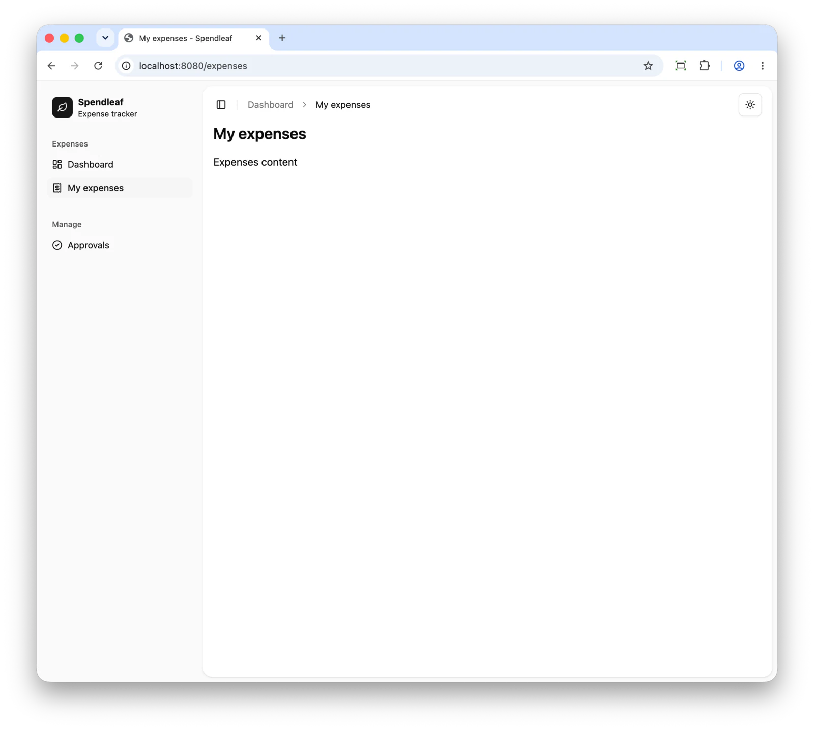
The application now shows Dashboard > My expenses at the top of the page.
Dashboard is a link that navigates back to the dashboard page.
Shadleaf code completion
If you are using IntelliJ IDEA for editing, you will have noticed that there is no code completion for the Shadleaf components.
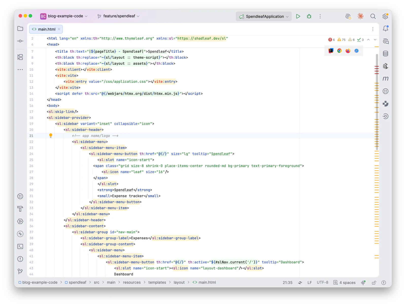
IntelliJ IDEA supports Web Types which allows you to place a JSON file in the project with all the tags and the properties of the tags. The IDE will use that information to provide code assistance.
There are two ways to get this file for Shadleaf. If you open the IDE Completion page in the documentation, you can download the file there and copy it into the root of the project.
Alternatively, you can add the following property to application-local.properties:
shadleaf.dev.web-types-file=shadleaf.web-types.jsonWhen you restart the application, the file shadleaf.web-types.json is written to the root of the project.
It is only rewritten when something changed.
|
Adding the property has an advantage over downloading the file. If you add your own custom components to your application, their properties will also be added to the generated web-types JSON. |
After that, all you need to do is inform IntelliJ IDEA of the file through the package.json:
{
  "devDependencies" : {
    "@tailwindcss/vite" : "^4.3.4",
    "@wim.deblauwe/vite-plugin-spring-boot" : "^1.1.1",
    "tailwindcss" : "^4.3.4",
    "vite" : "^8.3.5"
  },
  "name" : "spendleaf",
  "private" : true,
  "web-types": "./shadleaf.web-types.json",
  "scripts" : {
    "dev" : "vite",
    "dev-open" : "vite --open http://localhost:8080",
    "build" : "vite build"
  },
  "type" : "module"
}
Now IntelliJ IDEA recognizes the Shadleaf components and provides help and code completion for them.
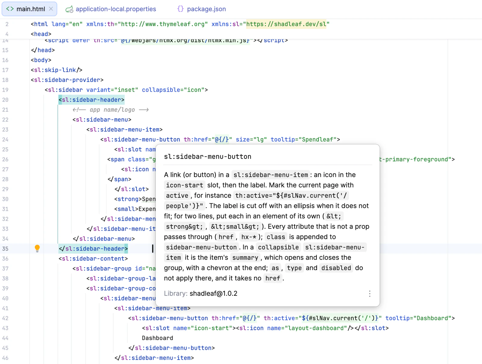
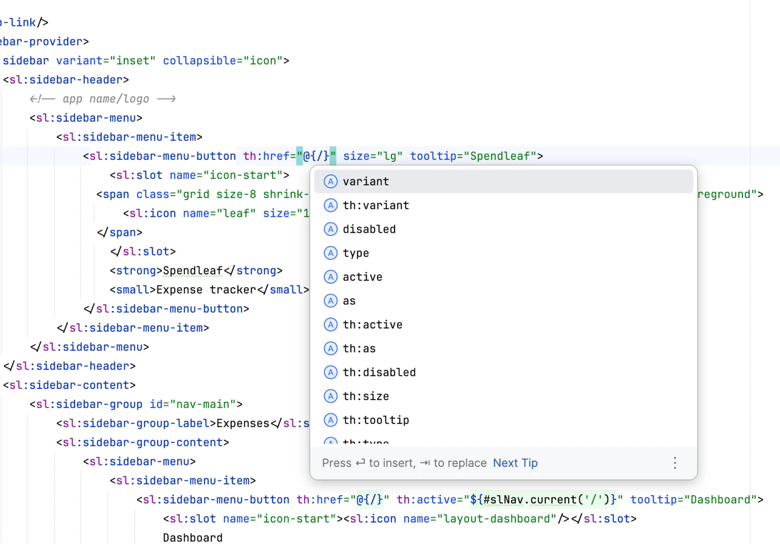
It knows all the attributes of each tag:
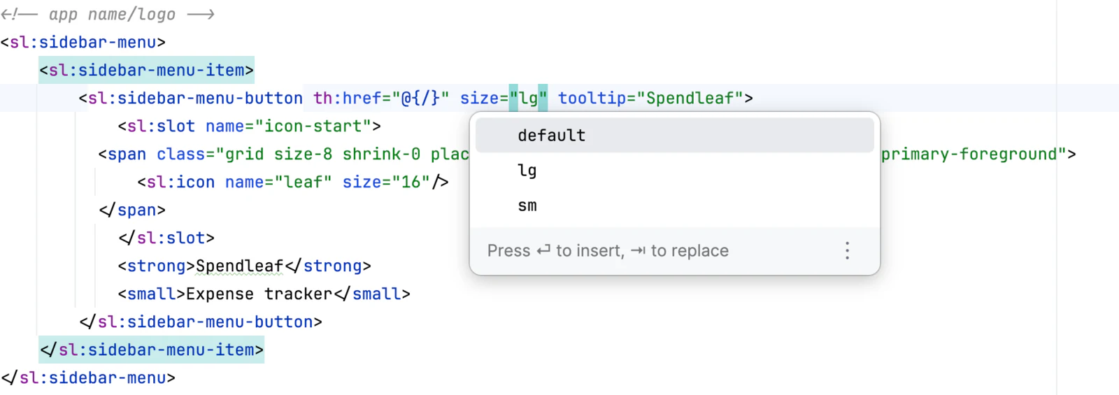
And the possible values for each attribute:
|
Add |
Checked prop values
Shadleaf checks if the value passed to a prop is correct.
Suppose you change:
<sl:sidebar-menu-button th:href="@{/}" size="lg" tooltip="Spendleaf">to:
<sl:sidebar-menu-button th:href="@{/}" size="xl" tooltip="Spendleaf">When the page reloads, Thymeleaf renders the template again, but it will fail with the following exception:
io.github.wimdeblauwe.shadleaf.component.ShadleafComponentException:
Invalid value 'xl' for prop 'size' of <sl:sidebar-menu-button>.
Must be one of: default, sm, lg.
(template: "layout/main" - line 24, col 21)
Note how it lists the accepted values, so you quickly know what you can use instead of the wrong value. Of course, if you use the web-types with IntelliJ IDEA, the value would already be red in the editor as well.
|
Shadleaf can only validate the values of props, not their names. If you write |
Conclusion
In this first part, we created the Spendleaf project with ttcli, built the application shell with a sidebar, a header, breadcrumbs and a theme toggle, and added IDE completion through web types.
We also saw how Shadleaf checks the values of props while rendering, so mistakes show up early.
The application is still empty, but it has a solid foundation. In the next part, we will add the first real page: a table of expenses with paging and sorting, backed by Spring Data JPA.
See spendleaf on GitHub for the full sources of this part.
If you have any questions or remarks, feel free to post a comment at GitHub discussions.